Concept / Strategy
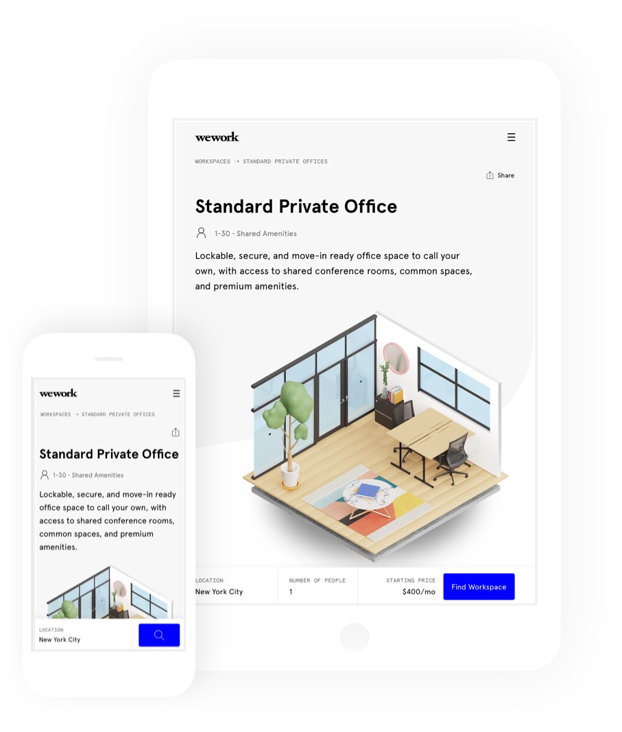
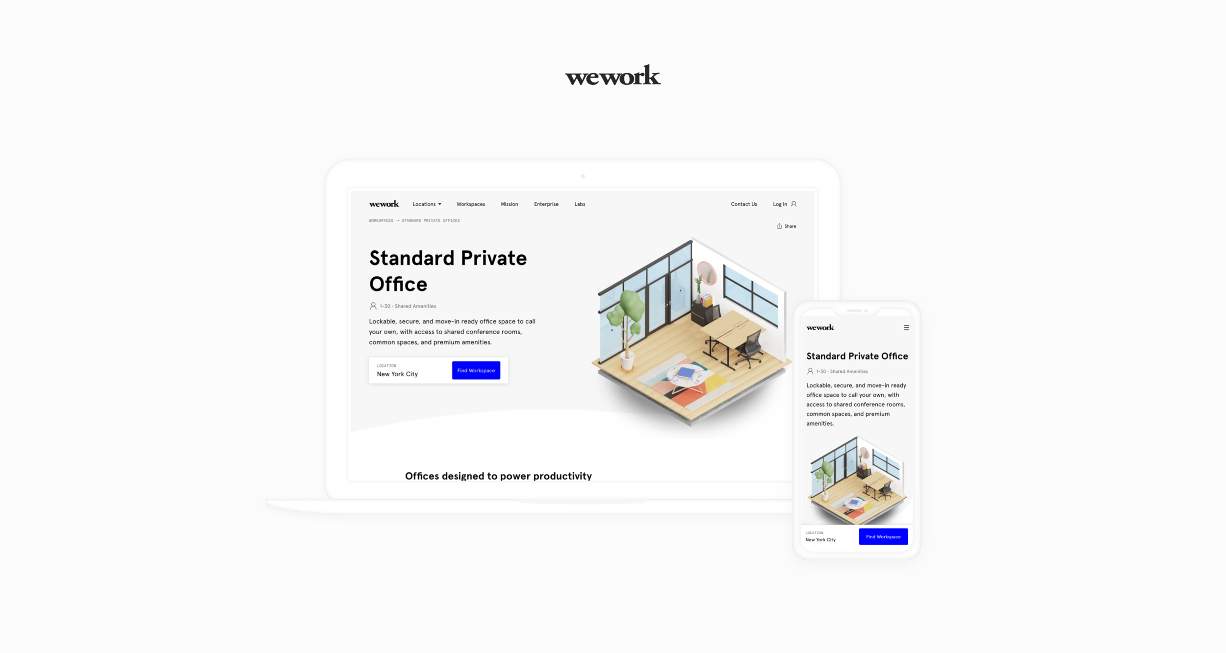
Visual / UX
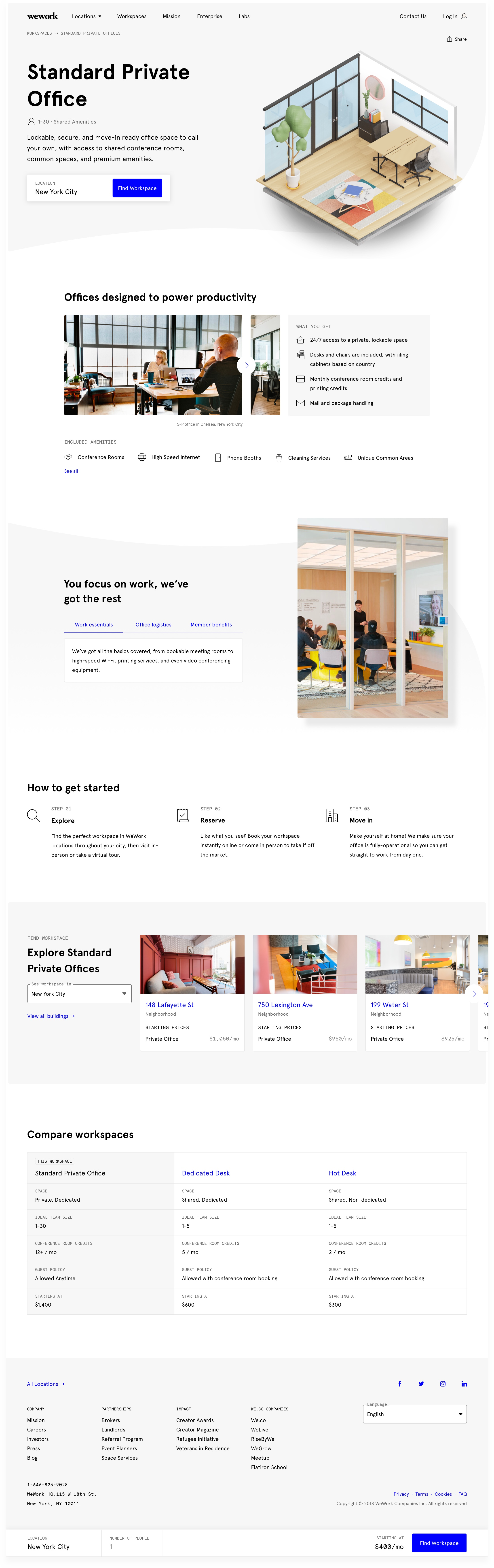
Redesign of the product pages on wework.com in order to improve the process of learning and comparing between different WeWork product offerings.
Opportunity
WeWork has over 10 different product offerings ranging from Private Office to Dedicated Desk to Global Access Memberships. Visitors to wework.com interested in workspace found it confusing to understand, compare and select a WeWork product that best fit their needs; data showed a high bounce and low conversion rates on this page.
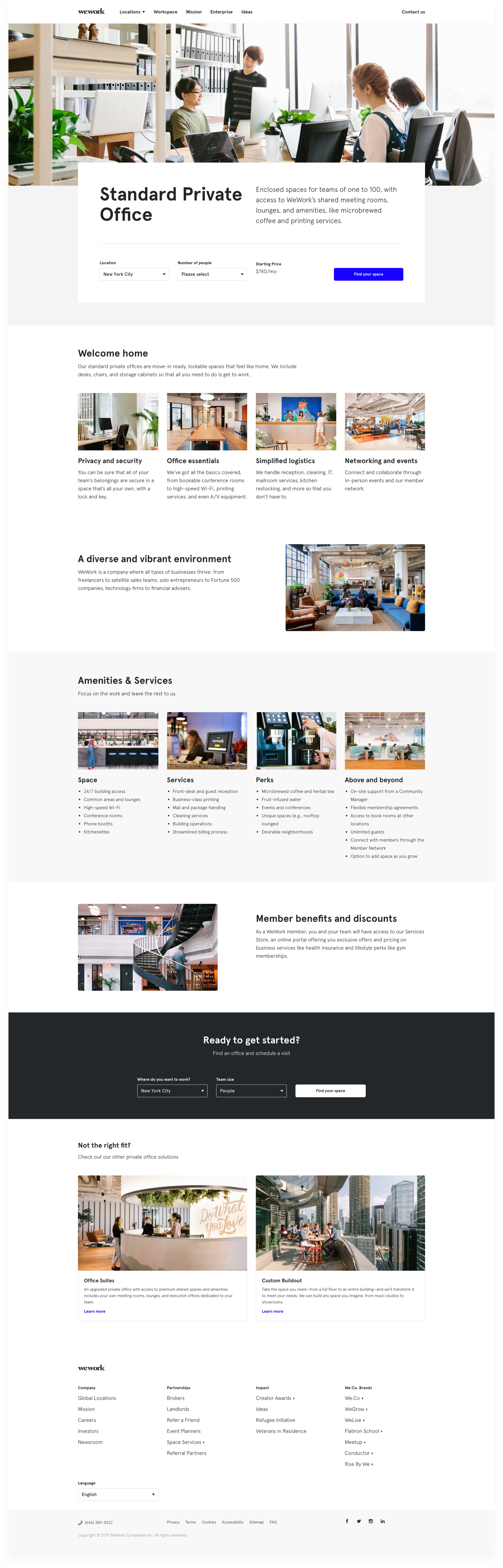
The existing page had not been updated for quite some time. It was still living under the old design system. Additionally, without any content strategy, the page was mostly made up of a hodgepodge of keywords and confusing internal lingo (see existing design at the bottom).
As part of the migration to the new design system, I redesigned the product page to be more user friendly, easier to navigate, and, most importantly, more straightforward for users understand a product and make a decision as quickly as possible.